


;)
;)


기준 금리 인상 여부와 재무제표 자산 축소를 언제부터 할 것인지에 관한 연준의 합의 결과가 발표되는 것이다.
그때까지 기다리지 않아도 미리 예측해 볼 수도 있다.
연준의 금리정책은 그동안의 거시 경제 지표 추이와 연준 위원들의 성향을 추적해 보면 미리 확인해 볼 수 있다.
![[김대호 박사] 미국 연준 FOMC 기준금리 미리 보는 법… FRB 금리 점도표의 비밀, 재무제표 자산 축소까지. 그림은 FOMC 점도표.](https://nimage.g-enews.com/phpwas/restmb_allidxmake.php?idx=5&simg=2017072615420703412906806b77b12114162187.jpg) 이미지 확대보기
이미지 확대보기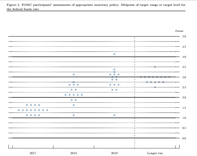
여기서 특히 중요한 것은 점도표에 담긴 비밀이다.
연준 점도표에는 연준 위원들이 스스로 예상하는 금리 인상 또는 인하의 시기가 나와 있다.
이 점도표 점을 찍는 연준 위원은 현재 모두 16명이다.
그림에서 보면 2017년 말의 경우 16명 중 8명이 1.25~1.50% 사이에 점을 찍었다.
이 논리대로라면 금년 중 한 차례 금리인상이 가장 유망하다
연준 점도표와 거시경제 지표 보는 법.
Economic projections of Federal Reserve Board members and Federal Reserve Bank presidents under
their individual assessments of projected appropriate monetary policy, June 2017
Advance release of table 1 of the Summary of Economic Projections to be released with the FOMC minutes
![[김대호 박사] 미국 연준 FOMC 기준금리 미리 보는 법… FRB 점도표의 비밀, 대차대조표 자산 축소 까지. 미국 연준 GDP 예상표.](https://nimage.g-enews.com/phpwas/restmb_allidxmake.php?idx=5&simg=2017072615433806067906806b77b12114162187.jpg) 이미지 확대보기
이미지 확대보기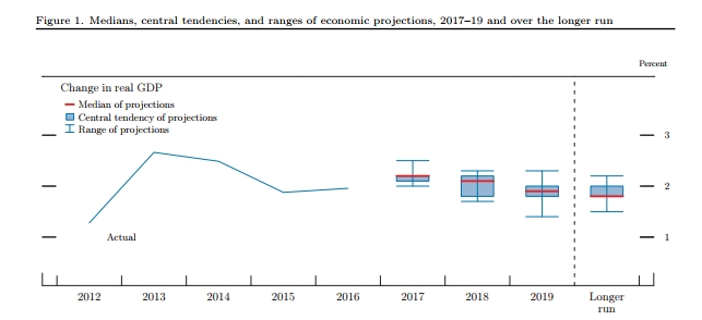
Explanation of Economic Projections Charts
The charts show actual values and projections for three economic variables, based on
FOMC participants’ individual assessments of appropriate monetary policy:
• Change in Real Gross Domestic Product (GDP)—as measured from the fourth
quarter of the previous year to the fourth quarter of the year indicated.
• Unemployment Rate—the average civilian unemployment rate in the fourth
quarter of each year.
• PCE Inflation—as measured by the change in the personal consumption
expenditures (PCE) price index from the fourth quarter of the previous year to
![[김대호 박사] 미국 연준 FOMC 기준금리 미리 보는 법… FRB 점도표의 비밀, 대차대조표 자산 축소 까지... 그림 미국 연준 FOMC 거시 경제 지표 전망치](https://nimage.g-enews.com/phpwas/restmb_allidxmake.php?idx=5&simg=2017072615441907880906806b77b12114162187.jpg) 이미지 확대보기
이미지 확대보기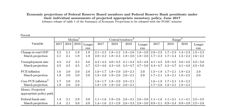
the fourth quarter of the year indicated.
Information for these variables is shown for each year from 2012 to 2019, and for the longer
run.
The solid blue line, labeled “Actual,” shows the historical values for each variable.
The solid red lines depict the median projection in each period for each variable. The
median value in each period is the middle projection when the projections are arranged from
lowest to highest. When the number of projections is even, the median is the average of the
two middle projections.
The range and central tendency for each variable in each projection period are depicted in
“box and whiskers” format. The blue connected horizontal and vertical lines (“whiskers”)
represent the range of the projections of policymakers. The bottom of the range for each
![[김대호 박사] 미국 연준 FOMC 기준금리 미리 보는 법… FRB 점도표의 비밀, 대차대조표 자산 축소 까지... 미국 실업률 전망치](https://nimage.g-enews.com/phpwas/restmb_allidxmake.php?idx=5&simg=2017072615444209254906806b77b12114162187.jpg) 이미지 확대보기
이미지 확대보기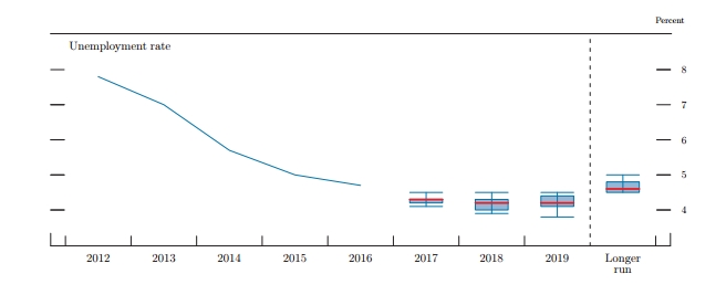
variable is the lowest of all of the projections for that year or period. Likewise, the top of
the range is the highest of all of the projections for that year or period. The light blue
shaded boxes represent the central tendency, which is a narrower version of the range that
excludes the three highest and three lowest projections for each variable in each year or
period.
The longer-run projections, which are shown on the far right side of the charts, are the rates
of growth, unemployment, and inflation to which a policymaker expects the economy to
converge over time—maybe in five or six years—in the absence of further shocks and under
appropriate monetary policy. Because appropriate monetary policy, by definition, is aimed at
achieving the Federal Reserve’s dual mandate of maximum employment and price stability in
the longer run, policymakers’ longer-run projections for economic growth and
![[김대호 박사] 미국 연준 FOMC 기준금리 미리 보는 법… FRB 점도표의 비밀, 대차대조표 자산 축소 까지...미국 인플레에션 전망치](https://nimage.g-enews.com/phpwas/restmb_allidxmake.php?idx=5&simg=2017072615451101738906806b77b12114162187.jpg) 이미지 확대보기
이미지 확대보기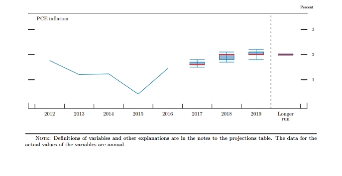
unemployment may be interpreted, respectively, as estimates of the economy’s normal or
trend rate of growth and its normal unemployment rate over the longer run. The longer-run
projection shown for inflation is the rate of inflation judged to be most consistent with the
Federal Reserve’s dual mandate.
For release at 2:00 p.m., EDT, June 14, 2017
Explanation of Policy Path Chart
This chart is based on policymakers’ assessments of appropriate monetary policy, which, by
definition, is the future path of policy that each participant deems most likely to foster
outcomes for economic activity and inflation that best satisfy his or her interpretation of the
Federal Reserve’s dual objectives of maximum employment and stable prices.
Each shaded circle indicates the value (rounded to the nearest ⅛ percentage point) of an
individual participant’s judgment of the midpoint of the appropriate target range for the
federal funds rate or the appropriate target level for the federal funds rate at the end of the
specified calendar year or over the longer run.
미국 연방준비제도 이사회 공식 자료
김대호 기자 yoonsk828@g-enews.com